Loadhog
Rebrand Design
Graphic Design
Photography
Logo Design
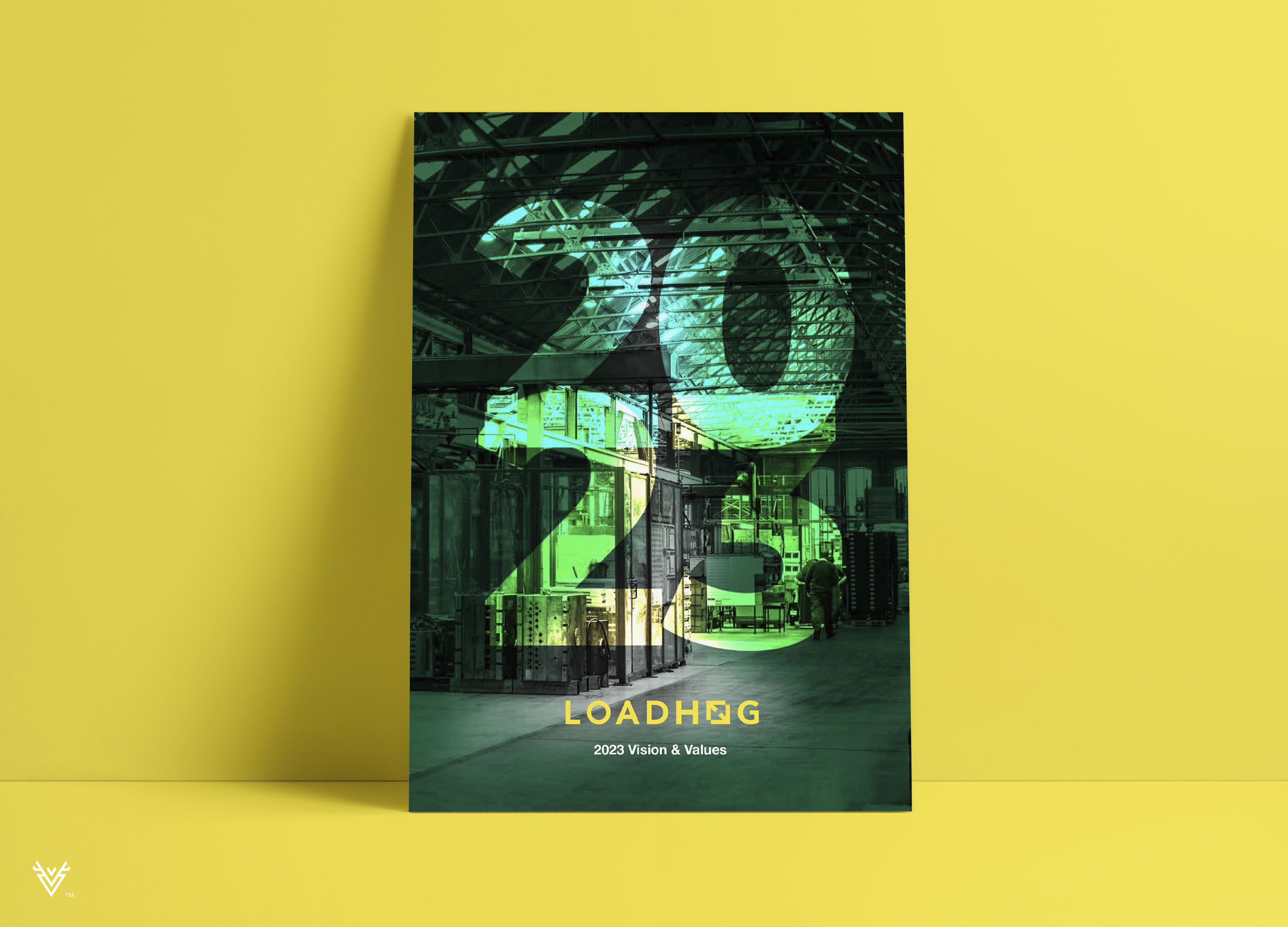
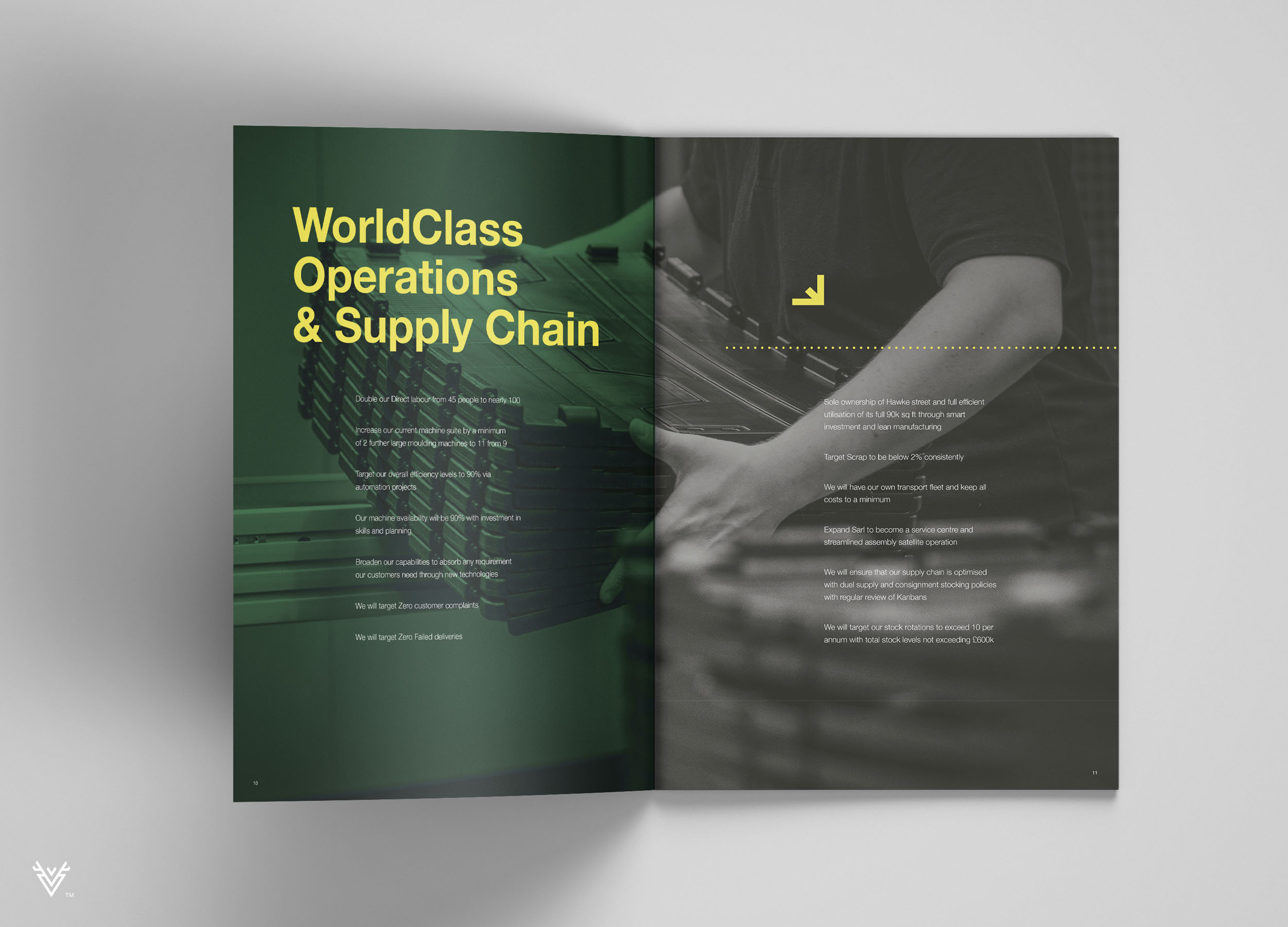
Brochure Design
Exhibition Design
Art Direction
The previous Loadhog branding and identity had become outdated and no longer truly reflected what Loadhog are about. As an employee owned business a sense of camaraderie runs intrinsically through everything they do.
The effects of the rebrand have been felt at every level of the business. A general sense of wellbeing and success follow the focus of this innovative company and their new identity.
I had the chance to reposition Loadhog so it had the greatest chance of achieving its five year vision plan. Design and rebrand the business so that it can communicate its core values to customers.
The Hogmark
Created by combining two core features of Loadhog. Packaging & Returnable Transit.
The Hogmark is a symbol of quality that has set a benchmark standard in the returnable packaging industry


"By 2023 we want to exceed £30 million. This brand prepares us for that."
JAKE CHARLTON - MARKETING MANAGER

